Pringles Logo History: Who Is Mr. P, and Why Did He Change?
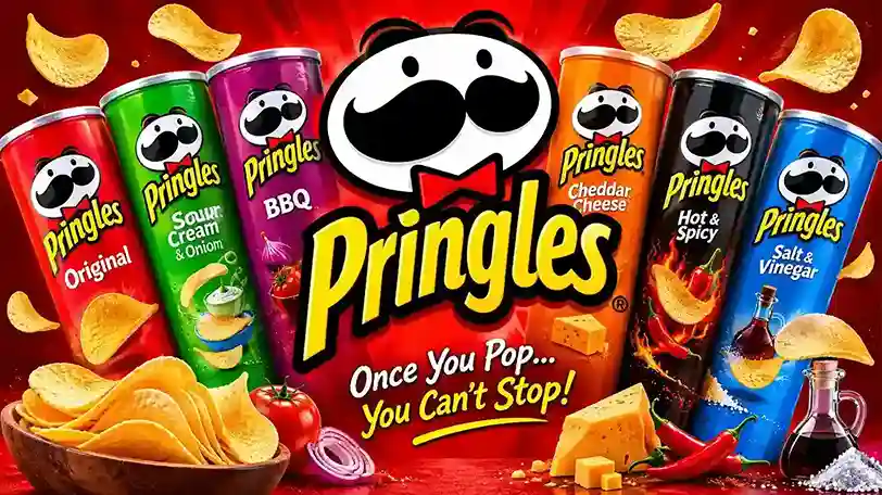
Tell someone to picture a snack mascot and many will draw a mustache first. That mustache belongs to the Pringles logo, yet most people cannot say who made him, why he changed, or who owns him now. Retellings online clash, and a wrong date can wreck a school report. This guide sorts fact from legend, step by step.
Quick answer
The Pringles logo shows a mustached cartoon man, Julius Pringles (Mr. P), beside the brand name. It debuted with the snack in 1968, and its biggest redesign arrived in December 2020. Mars Snacking has owned the brand since December 2025.
Where Did Pringles Come From?
Pringles began as a fix for a complaint. In the 1950s, shoppers disliked chips that arrived broken, stale, or greasy. Procter & Gamble (P&G) started work on a better chip in 1956.
The team built a crisp from a dough of dried potato and other ingredients, then pressed it into one curved, saddle-like shape. Uniform chips can stack, and stacked chips fit a tube. That tube became the brand’s second signature, right after Mr. P.
| Detail | What happened |
| Problem | Broken, greasy, stale chips in bags |
| Company | Procter & Gamble |
| Starting point | 1956 research project |
| Solution | A uniform, stackable crisp in a tube |
| Public launch | 1968, United States |
Popular retellings credit chemist Alexander Liepa with the recipe work. Fredric Baur, an organic chemist at P&G, designed the tube. Baur filed his packaging patent in 1966, and the patent office issued it in 1970 (US patent US3498798A).
The origin of the name “Pringles” is a puzzle. One story points to a street name in Ohio. Another points to an older potato patent. No primary source settles it, so this guide leaves the debate open.
What Is the Pringles Logo, and Who Is the Man on the Can?
The pringles logo combines a character and a wordmark. The character is Julius Pringles, whom fans call Mr. P. Kellogg, the owner in 2020, confirmed his full name as Julius Pringle.
The company trademarked “Julius Pringles” and “Mr. P” around 2013, according to food-history reports. Before that, the man on the can had no official name.
| Part | Role |
| Mascot | Gives the brand a face and a personality |
| Wordmark | Spells the name in heavy, friendly lettering |
| Red and yellow | Signal fun, appetite, and shelf impact |
| Mustache and bow tie | Make the character easy to recall |
Most snack brands lean on a symbol or an initial. This one leans on a person. That choice turns a package into a character you meet, which explains why the pringles logo feels warm instead of corporate.
How Did the Pringles Story Unfold, Year by Year?
The brand’s timeline mixes science, legal fights, and clever marketing. This table keeps the verified milestones in one place.
| Year | Event |
| 1956 | P&G begins searching for a less greasy, less fragile chip |
| 1966 | Baur files the tube-packaging patent |
| 1968 | Pringles launches in the United States |
| 1970 | The packaging patent is issued |
| 1991 | Pringles reaches the United Kingdom |
| 2008 | Baur dies; his family buries part of his ashes in a can |
| 2008 to 2009 | A UK tax case asks whether Pringles are “crisps” |
| 2012 | Kellogg buys the brand from P&G |
| Dec 2020 | First redesign in about 20 years |
| Oct 2024 | Pringles Mingles, the first bagged snack in over 15 years |
| Dec 11, 2025 | Mars completes its Kellanova purchase |
The Baur burial shows how deeply the can’s designer believed in his work. His children placed part of his remains in an Original flavor tube, as he asked.
What Roadblocks Did Pringles Face?
Two fights stand out, and both ask the same question: what counts as a potato chip?
In the United States, regulators pushed the brand toward the label “potato crisps” in the 1970s, because the product is not sliced and fried from whole potatoes. The wording stuck on cans for decades.
In the United Kingdom, the argument moved to tax. Under UK rules, potato crisps carry VAT, so P&G argued that Pringles were something else. The High Court sided with P&G in 2008. The Court of Appeal reversed that decision in 2009 and ruled that Pringles are crisps for tax purposes (Taxation magazine report).
| Dispute | Question | Outcome |
| US labeling | Can the product be called “chips”? | Brand adopted “crisps” wording |
| UK High Court, 2008 | Are Pringles taxable crisps? | Ruled for P&G |
| UK Court of Appeal, 2009 | Same question, on appeal | Ruled against P&G; Pringles are crisps |
Legal fights like these shaped the brand’s careful wording. They also gave Pringles plenty of free publicity.
What Does the Pringles Logo Mean?
Each feature earns its place. Together, they say “friendly, playful, slightly theatrical” in one glance.
- The mustache is the brand’s anchor. It survives every redesign and stays readable at thumbnail size.
- The bow tie adds a touch of formality that makes the humor land.
- The eyebrows and eyes carry emotion, which gives the character a mood.
- The oval face is a design reading, not a confirmed intention: it mirrors the curved crisp inside the can.
The pringles logo also works as a promise. A grinning host on the front suggests an easy, shareable snack. That promise matches the brand’s long-running “once you pop, you can’t stop” slogan.
How Has the Pringles Logo Changed Over Time?
The character stayed; the details moved. Design histories describe several refreshes, and the dates vary by source. This table marks which changes the sources agree on.
| Period | Look | Confidence |
| Late 1960s | Hand-drawn face, parted dark hair, thick mustache | Medium |
| Mid-1980s to mid-1990s | Rounder, softer features and a shorter name treatment | Medium |
| Mid-1990s to early 2000s | Brighter colors, tilted placement | Medium |
| Around 2002 | Eyebrows removed, red bow tie added | High |
| 2009 | Wordmark proportions refreshed | Medium |
| Dec 2020 (US), 2021 (elsewhere) | Bald, solid black eyes, arched eyebrows, flat artwork | High |
Two different designer names circulate for the original artwork. No primary document I reviewed confirms either, so this guide names no designer. That is better than guessing.
Why Did Pringles Redesign Its Logo in 2020?
Kellogg unveiled the new look in December 2020 and called it the first refresh in 20 years (Kellogg Company press release). Marketing director Gareth Maguire said the team spent two years testing styles.
The company described the new Mr. P with a “more dynamic mustache, sharper bow tie, sparkling eyes and expressive eyebrows.” The look debuted on the Scorchin’ flavor line, then spread across all brand communications in early 2021.
| Goal | What the brand did |
| Modernize | Swapped shaded artwork for flat, clean shapes |
| Spotlight flavor | Used bolder color blocks on each can |
| Add personality | Gave Mr. P different expressions by flavor |
| Keep recognition | Kept the mustache and the bow tie |
Fans noticed fast. When the redesign reached the UK in September 2021, social media filled with complaints about the missing hair. The brand held its course, which suggests the choice came from research, not a poll.
What Colors and Lettering Does the Pringles Logo Use?
Red and yellow lead the palette. Red signals energy and appetite. Yellow signals youth and fun. Black, white, and brown fill the face and details.
Color psychology gives general guidance, not hard proof, so treat these meanings as design logic. The pairing works on a crowded shelf because it stands out from the greens and blues that dominate many snack aisles.
| Color | Common design reading | Where it shows |
| Red | Energy, excitement, appetite | Can, bow tie, accents |
| Yellow | Fun, youth, warmth | Background, highlights |
| Black | Clarity, contrast | Mustache, eyes, outlines |
| White | Clean, simple | Details, borders |
The lettering uses a heavy, rounded sans style with friendly proportions. I could not verify a named typeface or a single font designer from a primary source, so this guide does not name one.
What Is the Pringles Logo Symbol, Really?
The symbol is a face. It is a cartoon man, not a food. That separates the brand from rivals that show a potato slice or a chip.
A face carries emotion, and emotion builds memory. Mr. P can look surprised, cheerful, or fired up. Because his features are few and bold, designers can redraw him without losing him.
The shape of the mark also helps in practice. It fits a round can, a wide bag, and a tiny phone icon. A symbol that survives all three sizes has done its job.
Who Owns the Pringles Logo Today?
Mars, Incorporated owns it. Mars completed its Kellanova acquisition on December 11, 2025, and Kellanova is the company formerly known as Kellogg (Mars announcement, SEC Form 8-K). The deal brought Pringles into Mars Snacking.
| Era | Owner |
| 1968 to 2012 | Procter & Gamble |
| 2012 to 2025 | Kellogg, later Kellanova |
| Dec 11, 2025 onward | Mars, Incorporated |
In 2011, P&G agreed to sell Pringles to Diamond Foods, but that deal collapsed. Kellogg then bought the brand in 2012. Both details come from business coverage of the period, so check them against a financial archive before you cite them in formal work.
Is the Brand Still Growing?
Yes. In October 2024, Pringles launched Mingles, its first bagged snack in more than 15 years. The bags still carry Mr. P, which proves the pringles logo works outside the tube.
New flavors, limited editions, and viral tricks keep attention high. A famous example is the “ringle,” a freestanding ring built from stacked crisps.
| Format | Job of the logo |
| Tube | Main shelf signal |
| Mingles bag | Shows the mascot travels beyond the tube |
| Flavor lines | Mr. P changes expression with the flavor |
| Social media | Flat art stays sharp as a small avatar |
How Does the Mascot Help Sell the Snack?
A mascot works like a salesperson who never takes a day off. Mr. P greets you on the shelf, in a TV spot, and on a social feed, and he looks the same each time. That repetition builds trust faster than any claim on the label.
The tube adds a second hook. You pull a stack, you see a face, and you remember both. Few snack brands pair a packaging shape and a character so tightly.
Flavor launches show the payoff. Each new line gets a color and a mood, yet shoppers still spot the brand from across the aisle. The mark does the finding for them.
| Marketing job | How the mascot handles it |
| Spot the brand fast | Bold mustache and bow tie read from a distance |
| Signal a new flavor | Color and expression change; the face stays |
| Stay consistent | One character across cans, bags, ads, and social |
| Feel friendly | A smiling host beats a plain label |
What Can You Learn from the Pringles Logo?
Four lessons stand out.
- Keep the anchor. The mustache and bow tie survived every update.
- Simplify for screens. Flat art scales from a phone icon to a billboard.
- Let the mascot show mood. Expressions create fresh content without a new logo.
- Test before you change. Pringles researched for two years before it shipped the redesign.
A good logo does not shout. It repeats the same friendly face until the face feels like a friend.
Can You Use the Pringles Logo in Your Own Work?
Treat it as a protected trademark. News, education, and commentary carry lower risk. Ads, merchandise, and anything implying endorsement carry higher risk, so ask the owner first.
| Use | Risk | Safer approach |
| School report or article | Lower | Credit the owner; imply no endorsement |
| Fan art or parody | Medium | Make the parody obvious; do not sell it |
| Merchandise | High | Request a license from Mars |
| Business marketing | High | Use your own branding |
This is general information, not legal advice. A trademark attorney can review your exact use.
Your Next Step
You now hold the verified story behind one of snack food’s most recognized faces. Put it to work. Compare an old can with a new one, sketch Mr. P from memory, or audit your own brand for one feature people could recall.
Spot a detail that needs correcting? Send it to the author and help keep this page accurate.